High-Intent Search

Spring is an e-commerce marketplace where people can discover and buy products from 1500+ brands.

2018 summer, I led the design from concept to delivery for High-Intent Search and Refine experience with a team of 6 talented people.

Background

User Retention
Increasing user retention was Spring's primary goal in 2018. We wanted to achieve 3 purchases per customer per year.

High-Intent Search
Search is the primary mechanism for second purchases. Especially for high-intent customers, making it easy to find what they want will increase the search-to-cart conversion and push user retention to a higher mark.

User Complaints
One of the complaints we heard very often is: searches yield too many broad results and that's overwhelming.

Scope

What this is
Search experience for high-intent customers who clearly know what they want (e.g. black Nick running sneakers).

What this isn't
Discovery or recommendation experience for low-intent cusotmers who are still exploring what to buy.

Success Metrics

Search-to-cart conversion
Search-to-PDP conversion
Search-to-love conversion
* PDP is referring to product detail page.

Understanding search behavior

User Interviews

I worked with our user researcher and conducted user interviews with 10 Spring users and 9 non-Spring users. We asked questions to understand their shopping preferences and tested Spring's search exerience on both desktop and mobile.

During the user interview process, I provided initial questions and search tasks. As the user interviews moved on, I started to build some assumptions and revised research questions/tasks based on previous interviews and my assumptions.

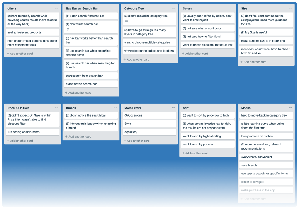
After interviews were done, I synthesized the interviews in Trello and found out the common themes for desktop and mobile search experiences.


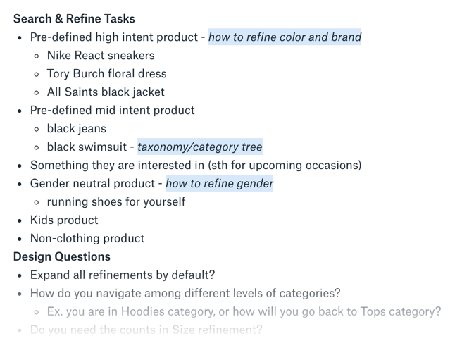
(First) Screenshot of some search/refine tasks for users.
(Second) Screenshot of research synthesis.

Take-aways

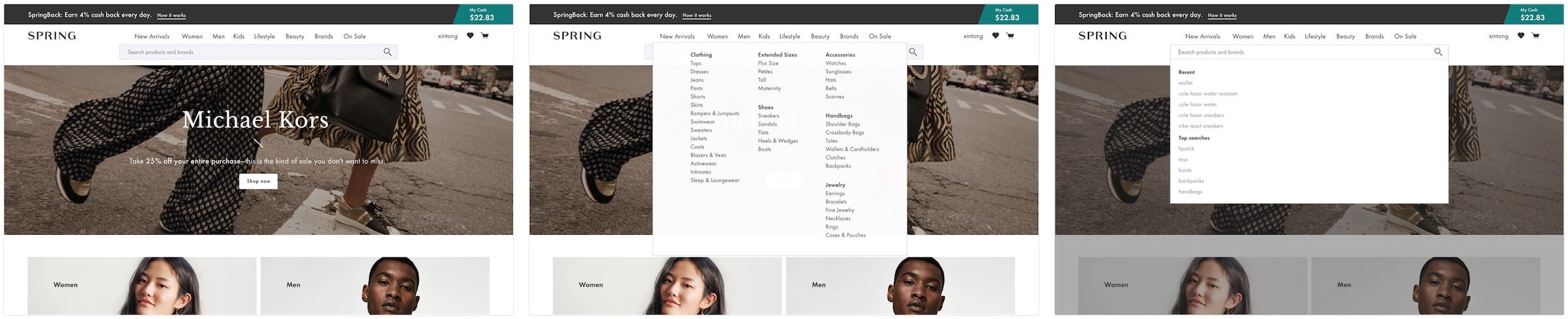
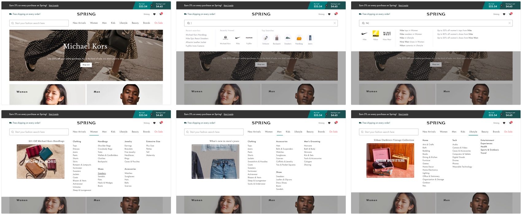
Nav Bar vs. Search Bar: Most users start search from Nav Bar and don’t trust Search Bar (generally on all shopping sites), but users do use Search Bar when searching with high intent.

Category Tree: Some users don’t realize they can utilize Category Tree to refine their search.

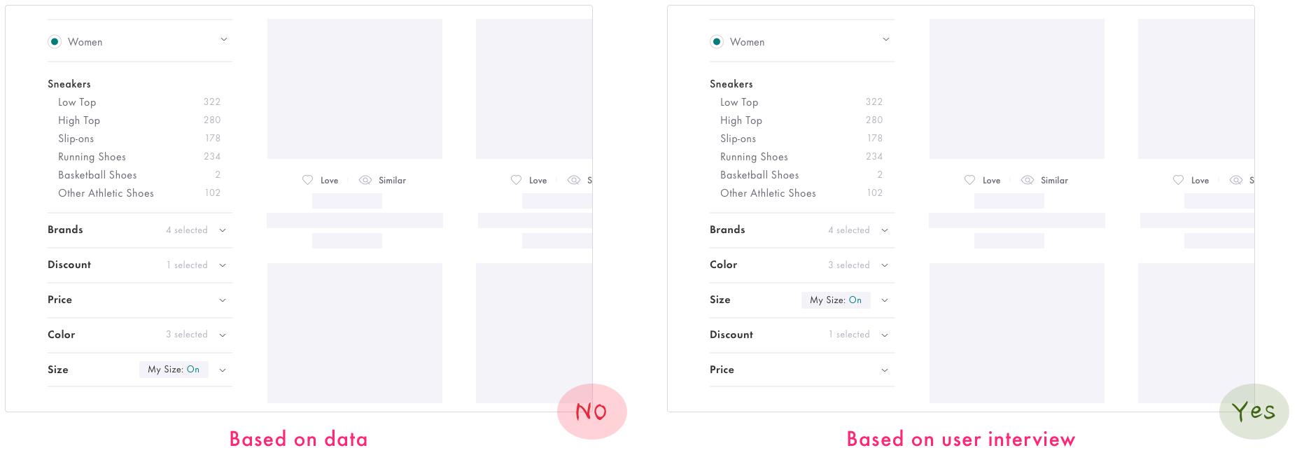
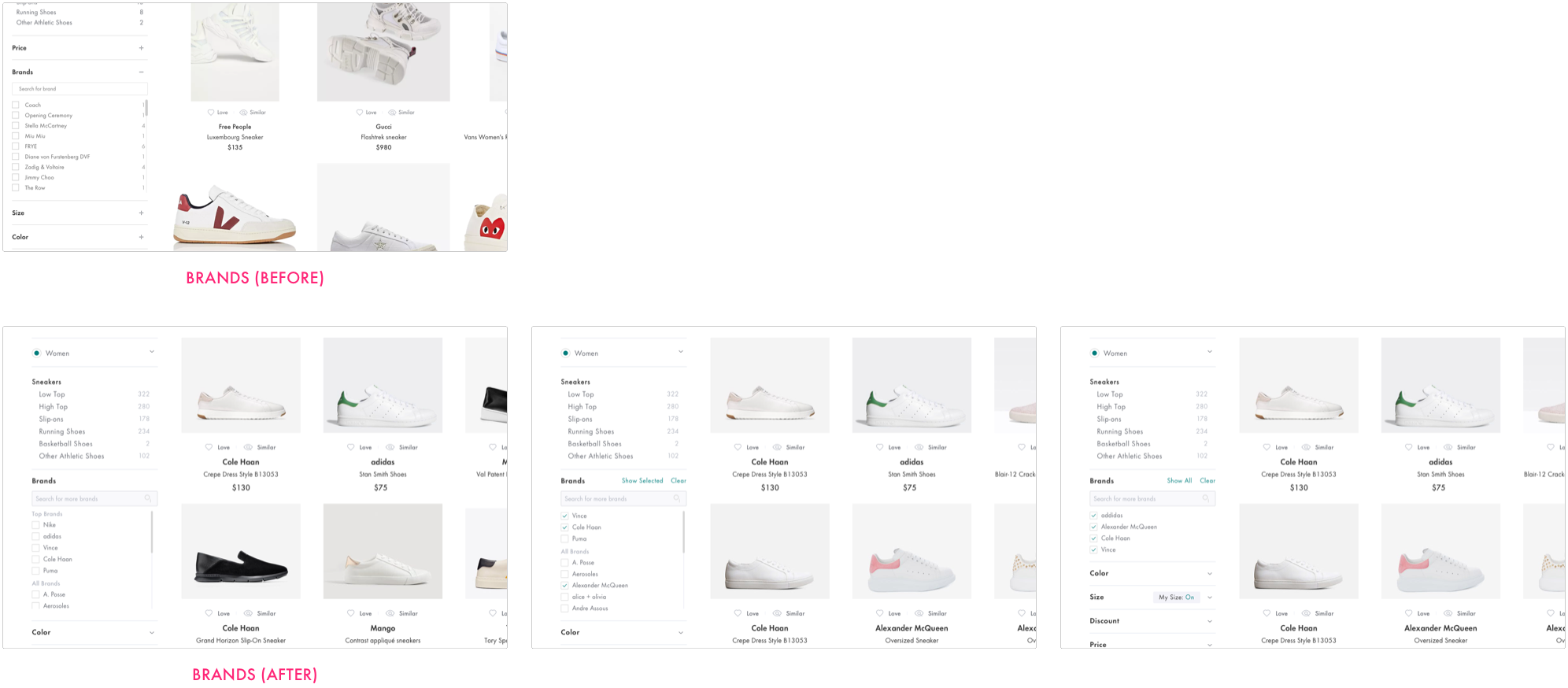
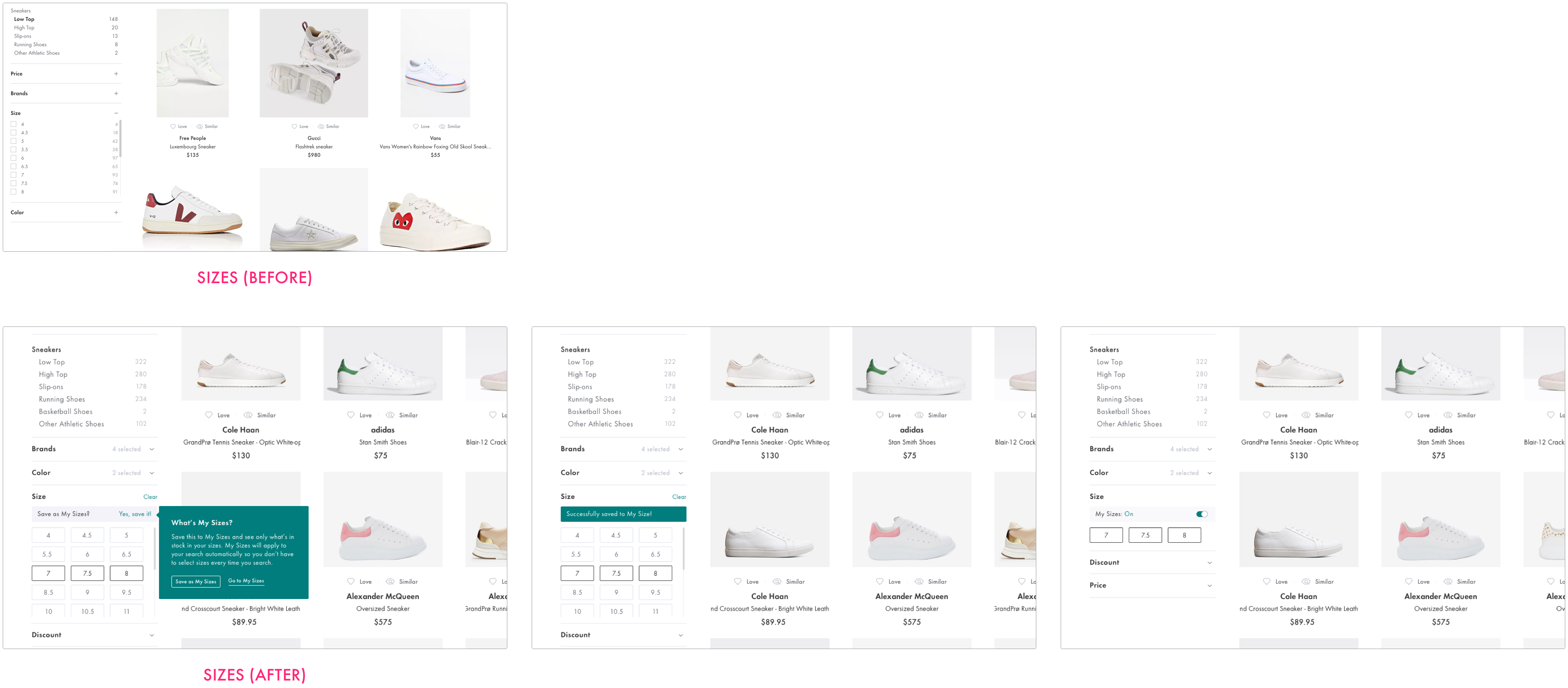
Refinements: All users further refine their search by Color, Size, Price, or Brands. There are some usability issues with each filter which makes the refine experience not very smooth.

Sort: Users prefer sorting by Lowest Price, but they feel the search results are not very relevant when they sort by Lowest Price.

Fun Fact: Men prefer having limited options and getting search done quickly, while girls prefer further refining their search and getting the best deal.

See full research synthesis


Quantitive Input

At the same time, I looked at data dashboard (Amplitude) to understand the problem from a quantitive perspective.

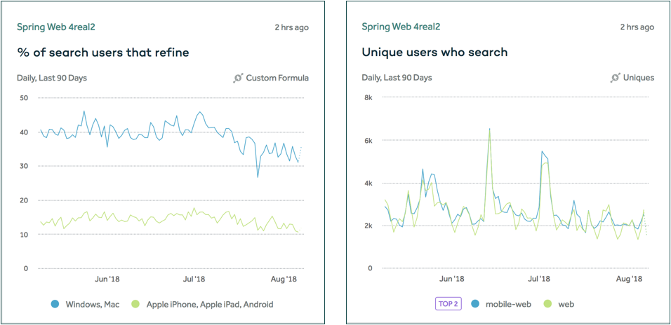
Here is the percentage of users who search and refine on different devices.

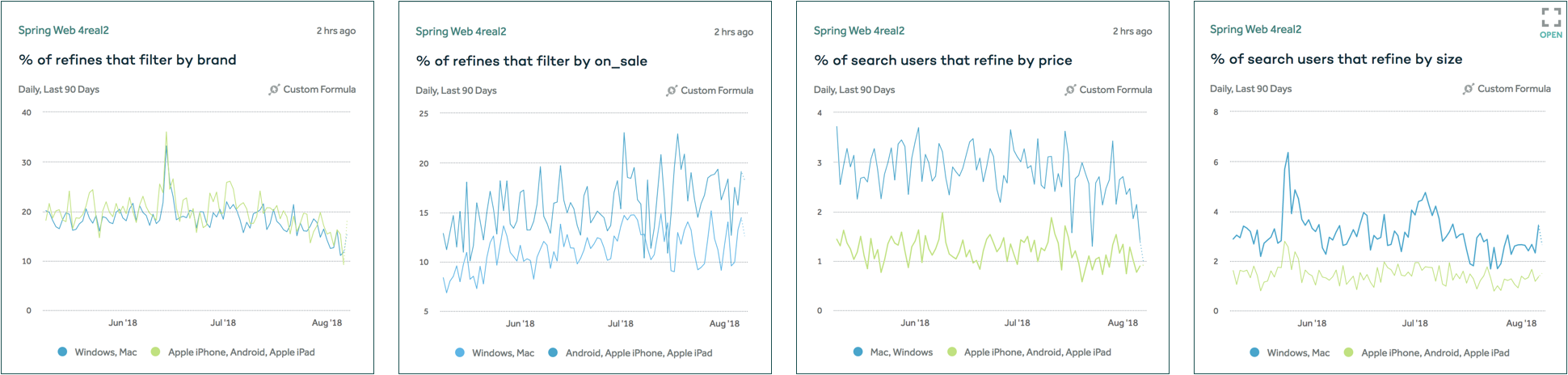
Here is the percentage of all users that refine their search by different refinements from high to low: Brands 8%, On 6%, Price 3%, Size 3%, and New Arrival 0%.

Take-aways

1. There are about the same amount of users who search on desktop and mobile, but there are more users who refine their search on desktop.

2. Users like to refine their search by brand and discount more than by size and color.
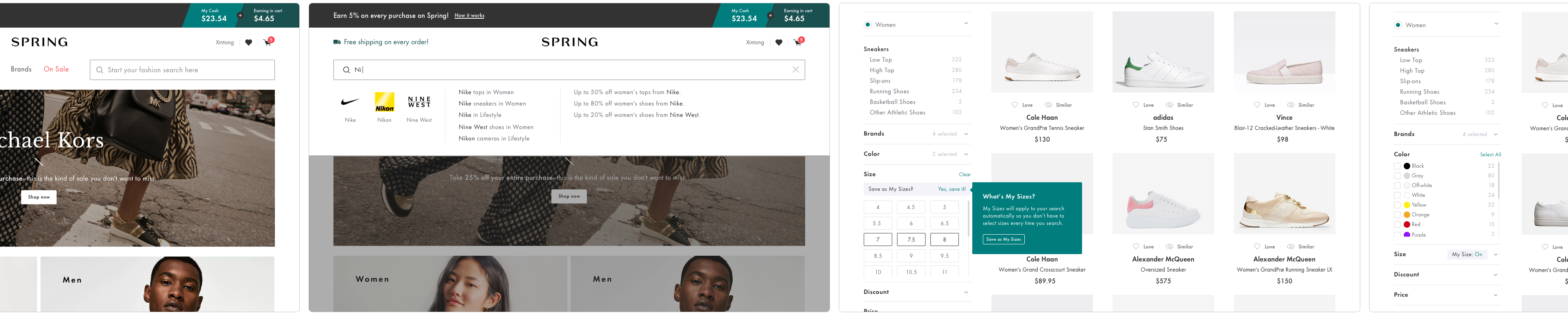
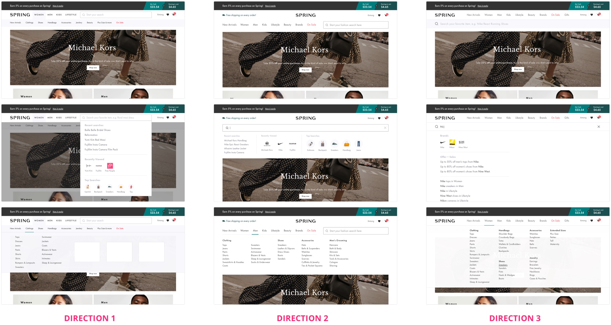
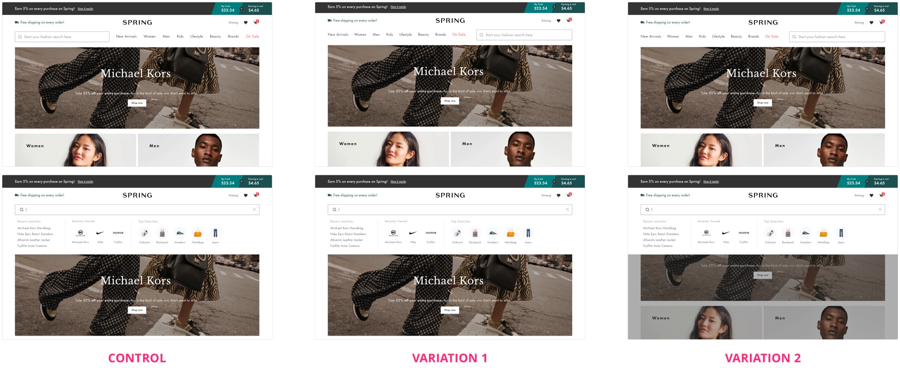
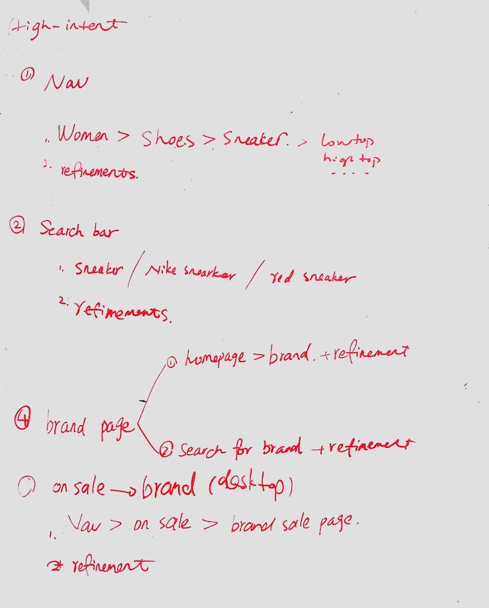

Search Flows

There are multiple entry points for Search. Before I officially started any design, I mapped out all the possible search flows so that I can take all possible scenarios into consideration.


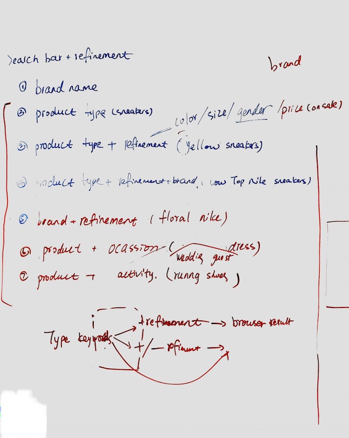
Sketch of all possible user flows.

With technical input from our tech lead, I was able to simplify the user flows into 3 different scenarios.


3 different entry points for search and refine.

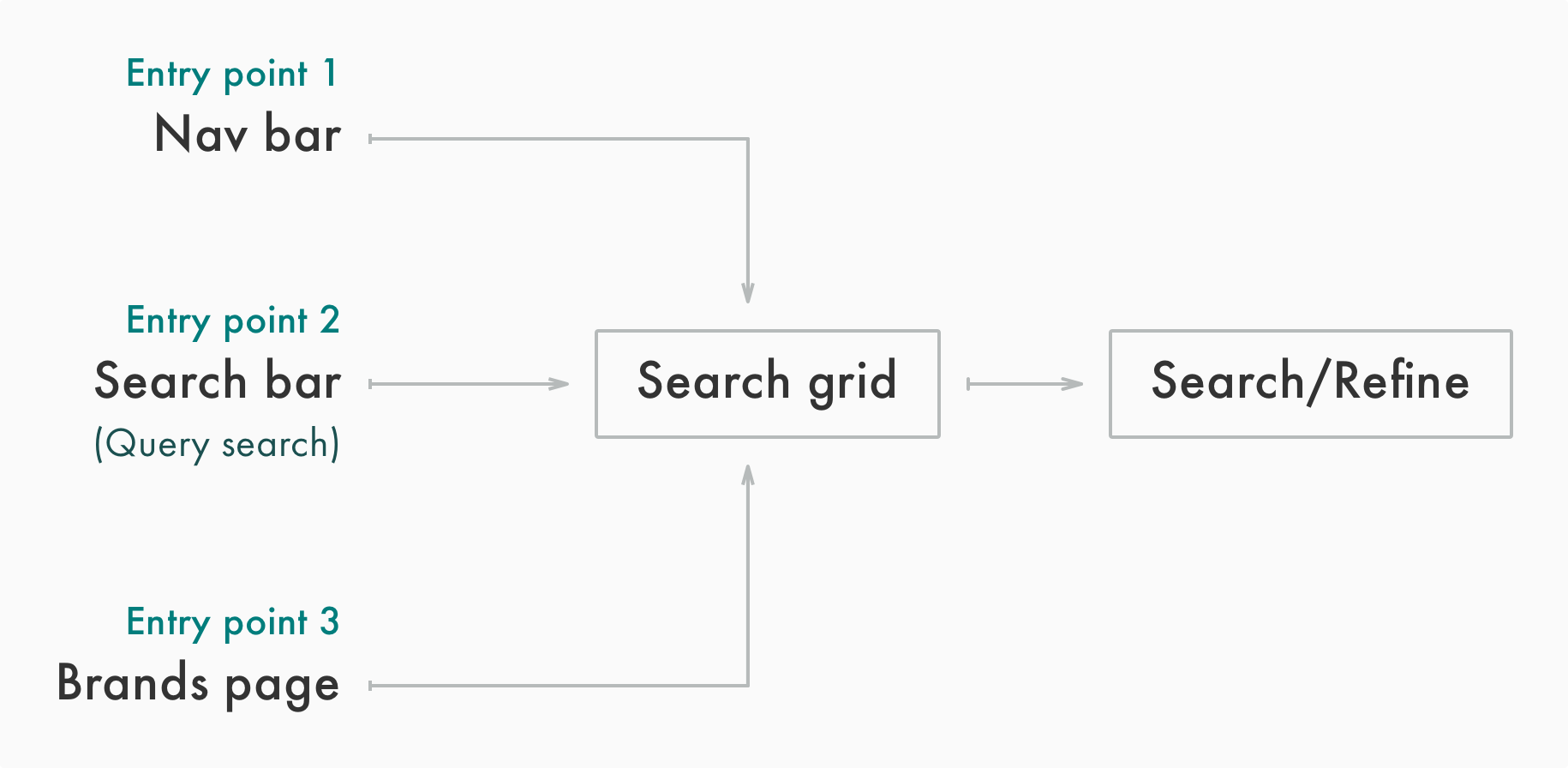
Auditing Taxonomy Tree

To better understand what products are available for the users to search and how Spring organizes all product categories. I took a close look at Spring's taxonomy tree.

Combining the research of taxonomy tree and users' search behaviors, I found out there were a few pitfalls in our taxonomy tree, which made some products less searchable/discoverable.


Spring taxonomy tree (Partial).
Some products are in both Men's and Women's;
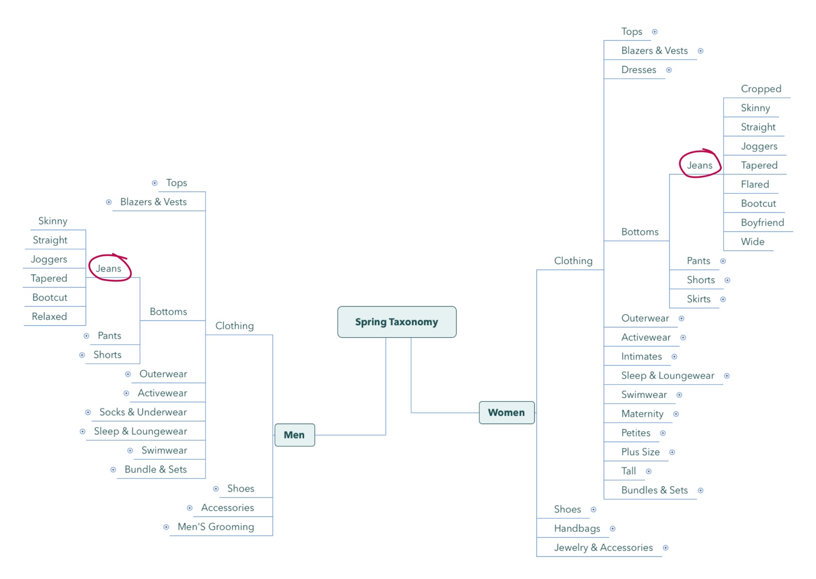
Men's beauty and skincare is Men's Grooming which is under Men's, while women's beauty and skincare has its own category which is not under Women's.


Taxonomy tree structure is not ideal because sometimes there are more refinement levels under a certain category. This explains why, during the user interviews, some users didn't click into "Swimsuits" and further refine their search.

Take-aways

1. There are some gender neutral products that are in multiple categories, e.g. jeans, tops, and sneakers.

2. The taxonomy tree structure is not ideal, which makes some products less searchable/discoverable.

Competitive Research

During the problem discovery phase, I was also asking myself what does a good search look like, what are the current solutions, and what can I learn from them? To answer all these questions, I conducted competitive research on other online shopping websites/apps, such as, ASOS, Lyst, ShopStyle, Revolve, and etc.

Here is a collection of the search experiences I went through: Search/Refine Competitive Solutions


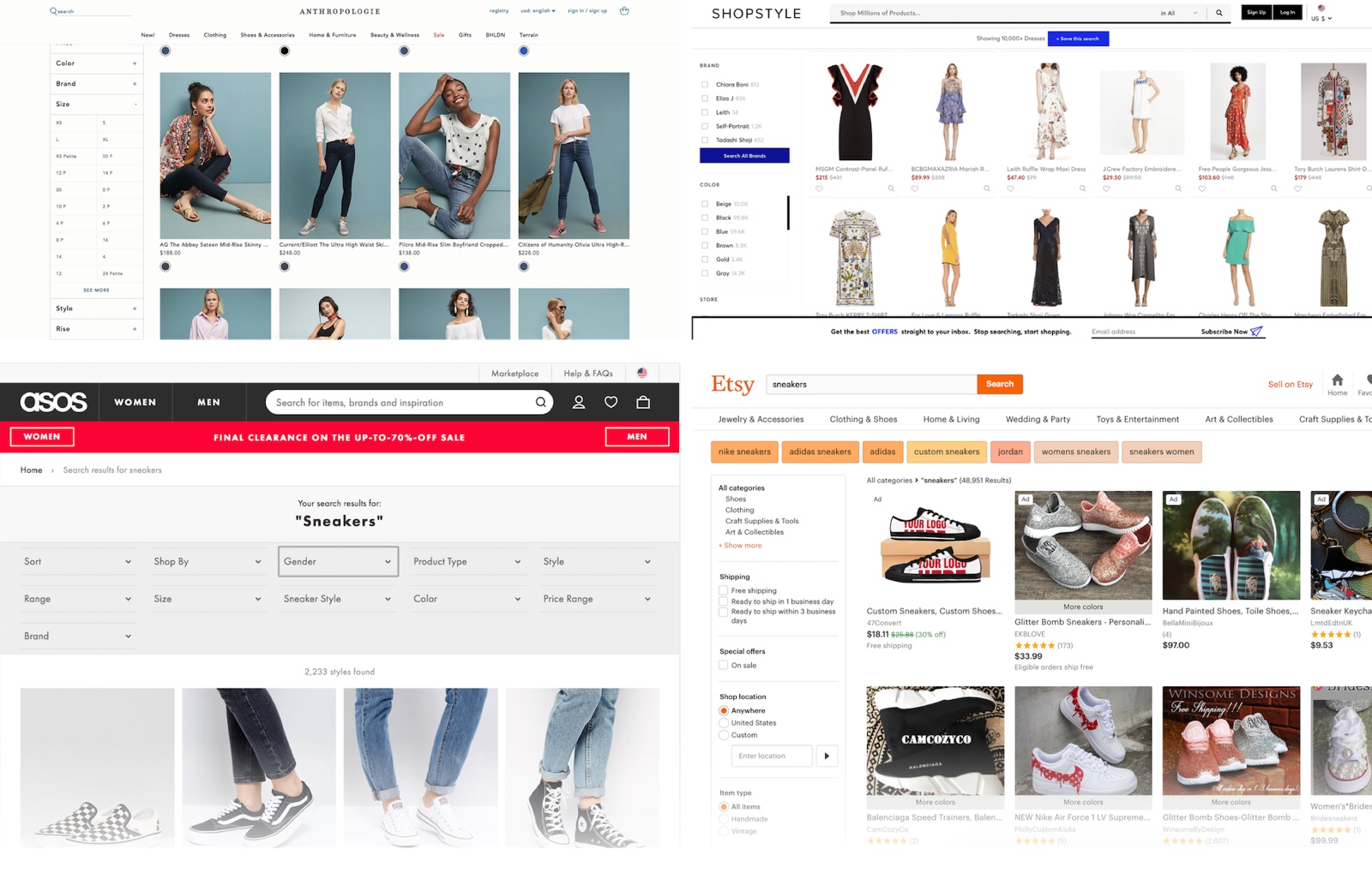
Screenshots of some competitive solutions.

Opportunity Assessment

After all researches and audits, I was able to connect the dots and see a whole picture of opportunities to improve High-Intent Search experience:

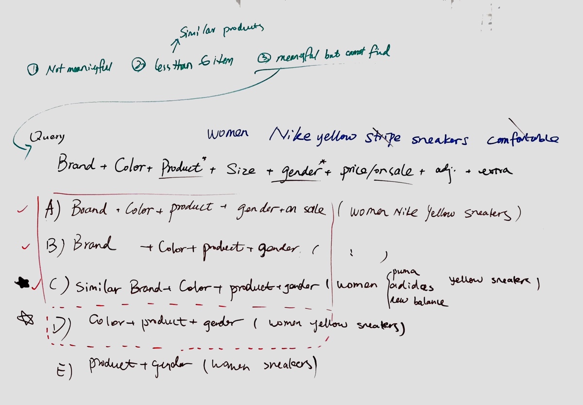
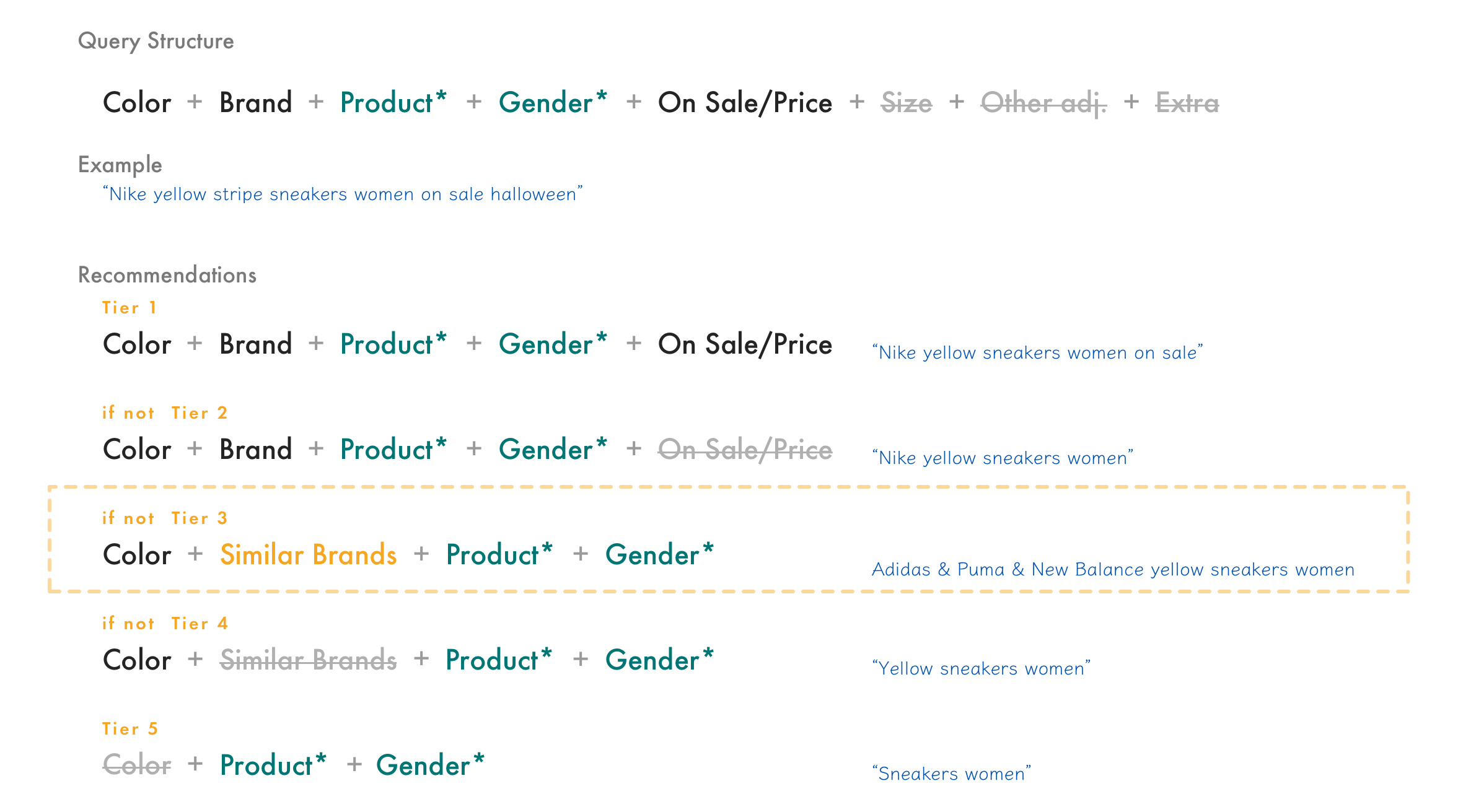
Natural language search
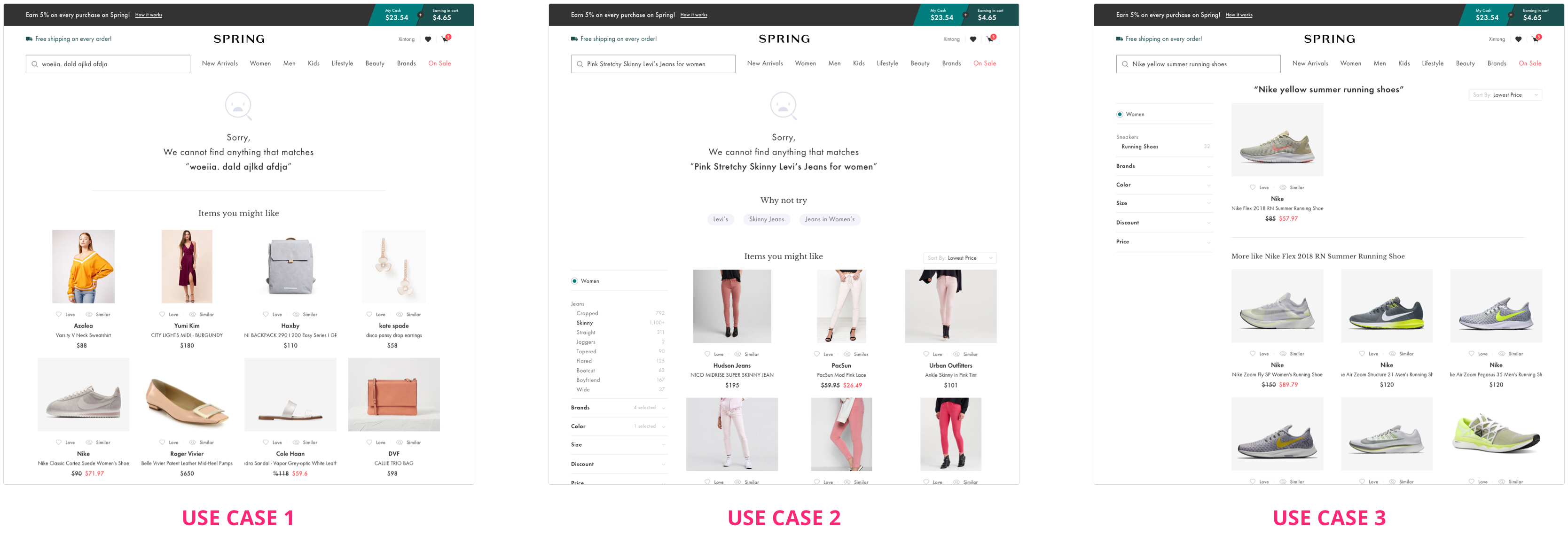
1) Introduce natural language search to customers and increase their confidence in expressing their search term in natural language.
2) Provide reasonable alternative when customers land on a no-results-found dead end.
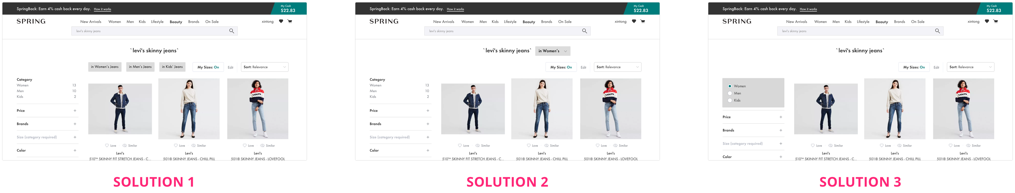
Category navigation
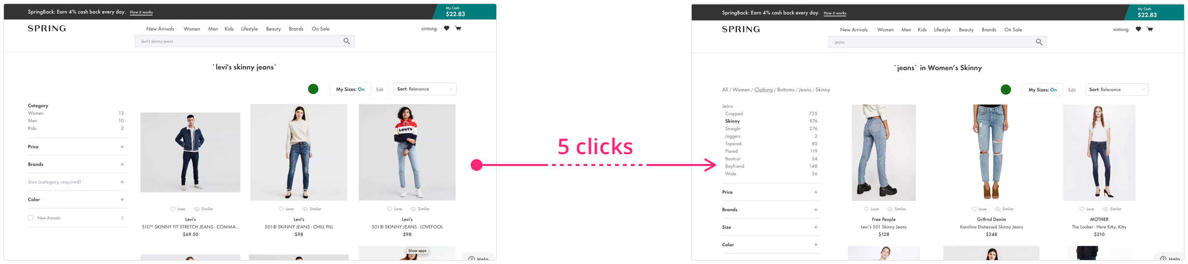
Make it easier for customers to navigate among diferent categories or search for gender-neutral products (e.g. jeans, sneakers, etc).

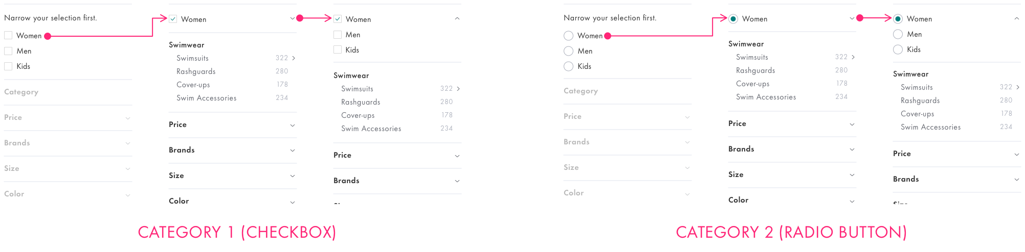
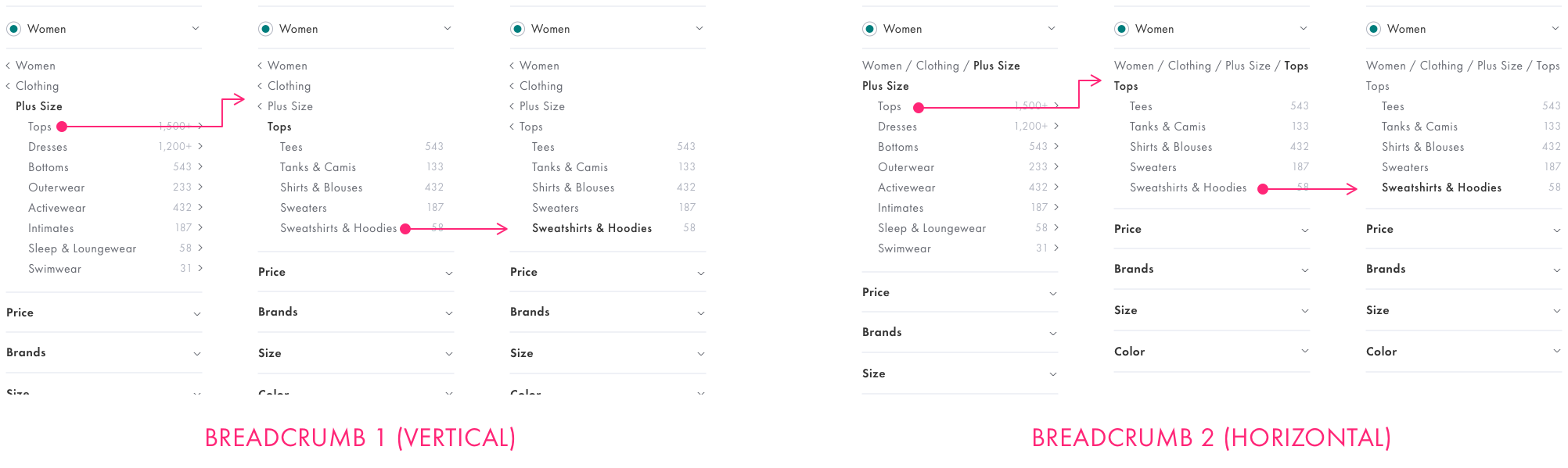
More intuitive refinements
Reduce frictions when customers refine their search by color, brand, price, and size.

Design & Iteration

Here are a few screenshots of the new high intent search and refine experience:

To better showcase how I landed on the final design solutions, I will dive into 3 design challenges and talk about my thinking processes:

After engineers improved the search algorithm, we were able to provide very accurate results for users' high intent search. However, 2 UX problems arose with the improved search functionality:

(1) Search Bar & Navigation

Even though query search is the most natural way to conduct high intent search, but we found out from user interviews that users usually don't start their search from the search bar because they usually don’t get relevant search results from most online shopping sites.

Design Challenge

How do we change users’ habits to get more users to start their search from the search bar such that users can find out that Spring provides a great query search experience?


Old search bar:
1. The search bar looks like a patch.
2. The navigation and search bar are awkwardly placed because users sometimes accidentally trigger the navigation dropdown, which then block them from using the search bar.

Competitive Solutions

I looked at some other shopping sites and analyzed what they wanted to achieve by designing their search in certain ways. I collected inspiration and competitive solutions in this doc: Search Bar & Nav Competitive Solutions

Design Explorations

I skipped wireframing since Spring already had a style guide in place.
Keeping the goal in mind, I sketched out design solutions in a few different directions. After I took marketing and other stakeholders’ opinions into consideration, direction 2 was the most promising one because it exposes all the product categories we carry at Spring and provides enough space for the navigation dropdown and search suggestions.

Testing

I dug deeper into direction 2 and wanted to find out how I could make it even better. I prototyped two variations for testing to see what's a better hierarchy for search bar and navigation, as well as, what's a better way to show search suggestions.


Control: The placement of search bar is prominent (left side), and search suggestions push the promotion banner further down.
Variation 1: The placement of search bar is consistant with other shopping sites (right side), and search suggestions push the promotion banner further down.
Variation 2: The placement of search bar is consistant with other shopping sites (right side), and search suggestions cover the promotion banner.

After testing with 2 separate groups internally, I chose Variation 1 as the final design. View Search Bar and Nav Prototype (V1).


(2) No Search Results

As more and more users are starting high intent query search and the search results are getting more and more relevant, we saw a higher possibility that there will be no results or a few results returned based on users' queries. In this situation, what should we show to users and how should we communicate with users to decrease their disappointment?

Use Cases

I started to figure out this problem from thinking of why there are no (or only a few) results returned. I found out there could be 3 different use cases:

1. User enters an unmeaningful query.

2. User enters a meaningful query, but these products don't exist in Spring.

3. User enters a meaningful query, and only a few (less than 6) products match the query.

User Experience

The principle for No-Search-Result design is to first clearly tell user there are not restuls (or few results) and then give relavent recommendations.

To figure out what are the best recommendations, I mapped out all possible recommendation solutions, looped in our tech lead to understand technical constraints/capability, and evaluated each solution to find the best ones.

Use Case 2 is the most tricky one. I decided to provide recommendations based on user's query. With tech lead and PM's input, we were every confident that we will be able to return relavent recommendation at Tier 3.

UI Design

We've already had Similar functionality built in our product, which is kind of close to Use Case 3 here. So I followed the UI of Similar and came up with the following solutions.


Use Case 1: Query is not meaningful. Recommendations based on Love and Recently Viewed.
Use Case 2: No products match the query. Recommendations based on the query.
Use Case 3: Only a few products match the query. Recommendations are similar products.

When users are searching for product with high intent, even though they’ve already type search query into the search bar, they still have go through 3 to 5 clicks in the category tree to get to the sub-category they are looking for. During user interviews, we saw that more than half of the users complained about this.

Design Challenge

We wanted to drop users on the right sub-category and skip all the clicks. But for gender neutral products (like jeans, sneakers, and etc), if users don’t indicate gender in their search queries, we won’t know which path they should follow.


For example, if user types “Levi’s skinny jeans”, we won’t know whether they are looking for women’s skinny jeans or men’s skinny jeans, or kids’ skinny jeans.

So we need the user’s input here. The challenge I faced was how to collect users’ inputs and make sure users won’t feel it’s intrude or redundant.

Because the category refinement and breadcrumb are always working together, when making changes on categor refinement, I alse need to take breadcrumb into consideration.

Design Explorations

I wireframed 3 potentials solutions, and decided to go with Solution 3. Because in Solution 3, it looks more like part of the refine experience, and in Solution 1 and 2 it takes too much primary space which could be used for something more important potential features.

Prototype and Testing

Within in Solution 3, I tried a few different visual treatments and prototyped 2 of them. We did intercal testing on category refinement and breadcrumb internally with 2 groups people.

I chose radio button for category refinement as the final design and handed it off to engineers. Because Option 1 could clearly tell user it requries a single selection and better aligns the front-end setup.

People found it's easier to go back and forth between different levels in the category tree, so we decided to implement the vertical breadcrumb.

(1) Hierarchy

Another challenge I had when designing High Intent Search experience was what’s the best hierarchy for all the refinements on search page.

I got 2 different inputs when I tried to figure out refinement hierarchy. Based on the data analysis, I saw there are more clicks on Price and Discount than Color and brands. But from user interviews, I found out people usually refine by brands and colors first, and then sizes, lastly price/discount. Because people don't want to limit the options at the beginning, and usually they don't have a clear bar for price.

I finally decided to set the hierarchy based on the input from user interviews, because I believed it’s the natural way of refining a fashion search.


Decided the hierarchy of refinements based on the most common use case we found during user interviews:
Categories, Brands, Color, Size, Discount, and Price.

(2) Refinements

Through user interviews, we saw different usability issues with different refinements. I created design solutions, tested them internally, and landed on the following design.

Brands

We listed all available brands A to Z before, which is very hard for users to browse and find out the brands that they are looking for. In the new design, we wanted to predit the brands people may click and list these brands at the top.

Which brands should be listed in the Top Brands group is still an open questions. We will testing among Favoirt Brands, Liked Brands, Popular Brands, and etc to figure which is the best.

Sizes & My Sizes

There were only a few size options before, and Sizes refinement was very apart from My Sizes feature, which meant users have to set up size preference at 2 different places. I improved the Sizes refinement by combining Sizes refinement and My Sizes and providing a better way of browse size options.

Next steps

Short-term

I wanted to see how this new design works from a quantative perspective. Even though we tested each piece either internally or with a small group of users, I still wanted to see if works well with all users and what we can improve to make this search and refine experience even smoothier.

Long-term

We have browse and recommendation in our roadmap as the next big step. I am very excited to do more research, understand users' browsing behavior, and figure out the design for low intent shoppers.

Another big question in my mind is how could we cover the needs of mid-intent shoppers? Do they exist? How does their shopping behavior look like?